Interpretation of traffic graphs
All our customers have the opportunity to observe the traffic graphs of their hosts. You may ask - why do I need it, and in general what is it? Let us answer the second question first - the host is a device that connects to the network and has an individual IP address. In your case it will be a device that is plugged directly into the UTP cable (Internet). So this might be a router and if you do not have it - a computer will be enough. Now it is time to find out why does the operator bother to provide me with this information?
Well, we wish to give you the opportunity to learn more about your connection. You can monitor the traffic and the number of packages generated by your boundary device. Your roommate says he does not use Peer2Peer programs (torrent) or that at night all the computers are turned off? Or maybe a program is running without your permition and sends spam, for example?
Good interpretation of the charts does not require specialized knowledge, and helps to solve many potential problems.
Let's get to the point - what are we talking about anyways?
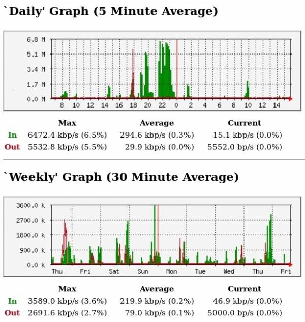
The charts you can see in our CUSTOMER PANEL. After logging in (you will find login data in the contract. You can always contact our customer service to recover access) enter the tab MY HOSTS and click on your host. You'll see something similar to the chart which you can see below. You must keep in mind that the graph of motion is AVERAGE. Accordingly, the graph cannot be interpreted as their speed. This is traffic that was generated in a specific unit of time and averaged.
If the day before you watched videos on Youtube or obtained any data from the network - you will surely see it on the chart.
The legend is relatively simple:
- Green it's download
- red it's upload
- MAX is the maximum speed in a given unit of time,
- AVERAGE is the average speed over the chart,
- CURRENT it's your currrent speed,
- the horizontal axis represents the time,
- the vertical axis is the speed of connection
Example, which was placed above can be considered as typical. Short interpretation - between 19.00 and 20.00 and from 21.30 to 23.30 John Smith fetches quite a lot of data (green parts of graphs). Below the main chart interval of 5 minutes you can see the John's traffic from last week (interval 30 minutes).
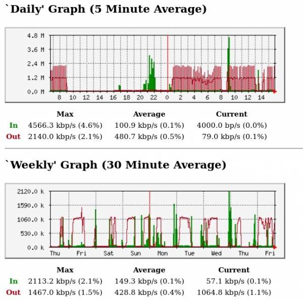
Let's see another exemplary graph:
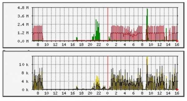
At our disposal is also a graph of traffic packets of data (yellow graph).
Here we see that John probably uses a program to exchange data. Perhaps Peer2Peer (torrent), or worse, an unwanted program running in the background of his computer. A clear red spikes are specific to P2P exchange. You have to bear in mind that these programs generate a very large number of connections in both directions to our host, which can lead to slower links - display a slower web pages, picking streaming movies or so, lag in online games. This problem does not arise from any restriction made by Operator's Internet network - this is just characteristic of P2P programs. You should pay particular attention to the number of packets (yellow graph) - if their value fluctuates around 2k (two thousand), this is normal. If the exchange occurs 10k - this is a behavior deviating from the standard connection.
If our chart looks similar to this and we consciously download data via P2P - then everything is just perfect. We can always disable the program that generates such a move. However, if we do not use such software on your computer and neither does our roommate - it means that something is wrong. Probably one of our computers might be infected with malware. There are many types of spyware / malware / virus so it is difficult to find a immediate solution. Above all, we must be vigilant and quickly scan all COMPUTERS IN OUR NETWORK (home) using antivirus programs.


